|
The Evolution of Shell Scott
|
||
|
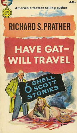
GM 677 GM k1471
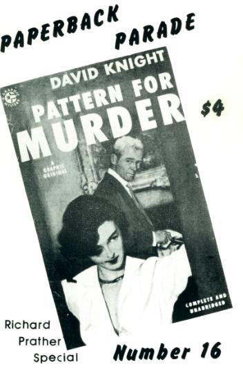
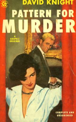
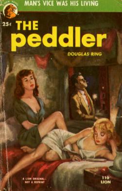
PP16 Graphic 48 Lion 110
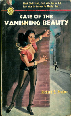
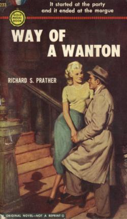
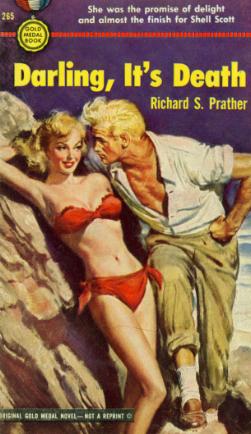
GM127 GM233 GM265
GM341 GM413 GM551
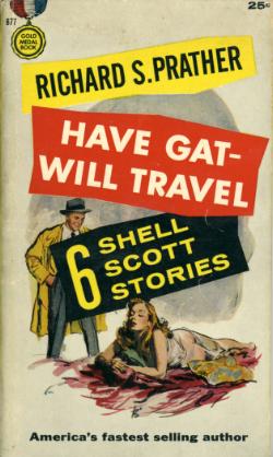
GM 770 GM830 GM s817
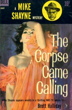
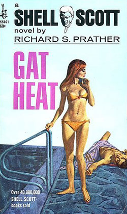
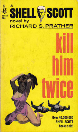
Dell D401 Pocket 55021 Pocket 55025
|
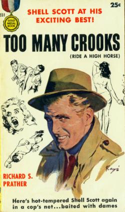
This discussion is the result of a question sent to me by Brian Maginnity, who sent the two scans at the left and wanted to know where the heck the hat went. The answer involves how a company decided to market one of the most famous hardboiled detectives in literary history. (I say "discussion" because if anyone wishes to add a comment, I'll post it on this page.)
Paperback Parade #16 is Gary Lovisi's "Richard Prather Special Edition," and was published in 1990. Prather died in 2007. His last novel, Shellshock, was published in 1987 by Tor Books. Two of his pseudonyms are represented at the left, but in the PP article, the author states that all of his major characters are based on his concept of Shell Scott.
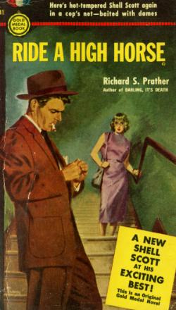
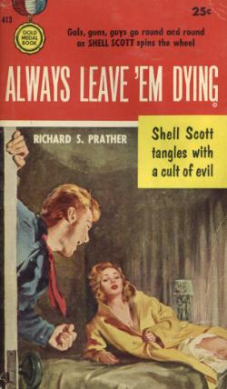
Gold Medal 127 was Prather's first published novel, and it introduced the famous PI. In Prather's words, "Sheldon Scott was born in 1949, when he was 30 years old." And, of course, he never aged a day for the rest of his life. Gold Medal used a staff of artists, and the specific illustrators for many of its covers are unknown.
It is not odd that a book's cover will have little in common with its actual character, but Prather did a pretty good job of describing his detective. One of Mr. Scott's outstanding physical characteristics was his hair, which was so blonde as to be almost white. On paperback covers, this feature was routinely covered with a fedora, then overemphasized, then ignored altogether as he was given dark hair, then blonde again, and finally white as snow.
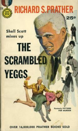
The man that eventually came to grips with what the character would look like was Barye Phillips, who did most of the covers to the left (GM 341, 413, 551, 770, s817 & 830), as well as the two images at top.
Eventually, that particular pose became the standard for all the Shell Scott novels. But to emphasize the hair to the greatest extent, Phillips first lost the hat, and then began to "float" the image of the detective above (or alongside) other artwork that is intended to illustrate the story.
That particular feature had already proven effective with another serial detective at Dell Publishing: Brett Halliday's Mike Shayne series, in which Robert Stanley's illustration of Shayne (actually a Stanley self-portrait) is always seen floating above the famous Robert McGinnis cover art.
The concept followed Shell Scott when his creator switched to Pocket Book in the 1970's, and while the now-famous Barye Phillips image could not make the leap between publishers, Scott's general appearance remained the same.
The scan of Gold Medal 127 is courtesy of Paul Eng. The two Pocket Book scans are courtesy of Brian Maginnity.
|
|